
A NEW ERA FOR R-LINE TOOLS
Precision-Engineered Equipment Deserves Precision-Engineered Design.
Smarter Tools. Sharper Edges.
Since day one, R-Line Tools has been driven by one goal: building high-performance, purpose-built gear that makes your shop operations smoother, faster, and more precise.
As our product lineup has evolved, we realized our branding needed to evolve with it. We’re officially retiring our original logo and rolling out a redesigned, aggressive visual identity built for the next generation of our tools.
Out With the Soft.
In With the Sharp.
The previous branding featured softer, rounded geometry—it served us well, but it didn't fully capture the mechanical precision and sharp lines of the tools we actually design and manufacture.
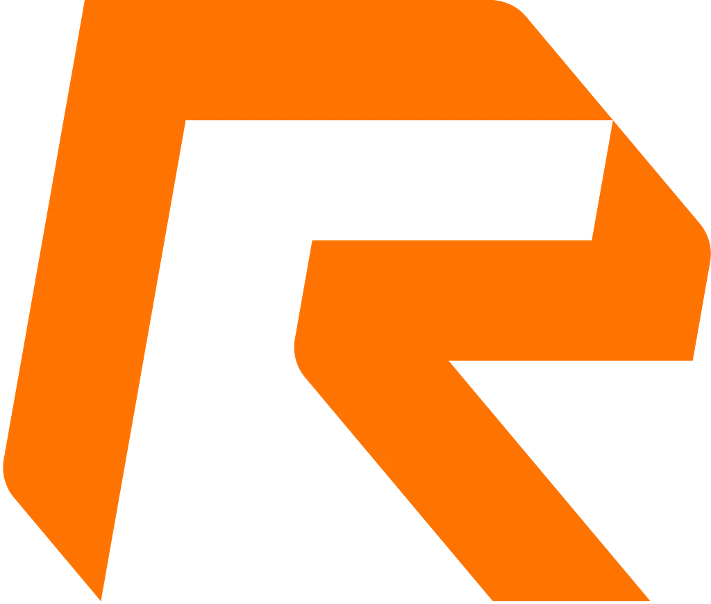
Our new icon strips away the soft curves in favor of chiseled geometry, high-speed slants, and bold industrial lines.
What’s Changed:
-
Angular Geometric 'R' Icon: High-impact, sharp-edged icon finished in our signature high-visibility orange. Designed to stand out on product markups, custom 3D-printed hardware, and pit boxes.
-
Modernized Typography: Bold, italicized text paired with clean wide-format lettering that mirrors speed, accuracy, and engineering precision.
-
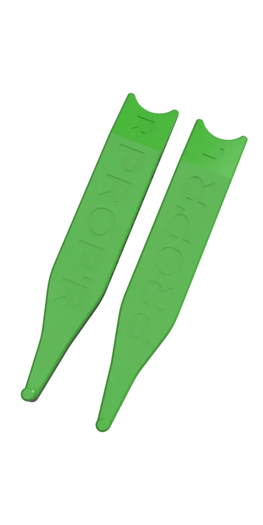
Unified Product Line Branding: A seamless look across all current and upcoming tool lines—including the PROP'R (PRO & STANDARD), EDGE'R, and LIGHT'R.
Same Quality.
Tougher Identity.
While our look is getting a major upgrade, the philosophy behind R-Line Tools remains identical:
-
In-House Innovation: Engineered by installers, for installers.
-
Durable Construction: Built to handle daily rigors in demanding shop environments.
-
Uncompromised Function: Purpose-driven tools designed to eliminate hassle and elevate your workflow.
Look out for the new look rolling out across our social media, online store, and shop gear over the coming weeks.